Knowledge Graph Visualization for Research Agent Outputs
Visualizing knowledge graphs turns research agent outputs into navigable, fact-checked networks.

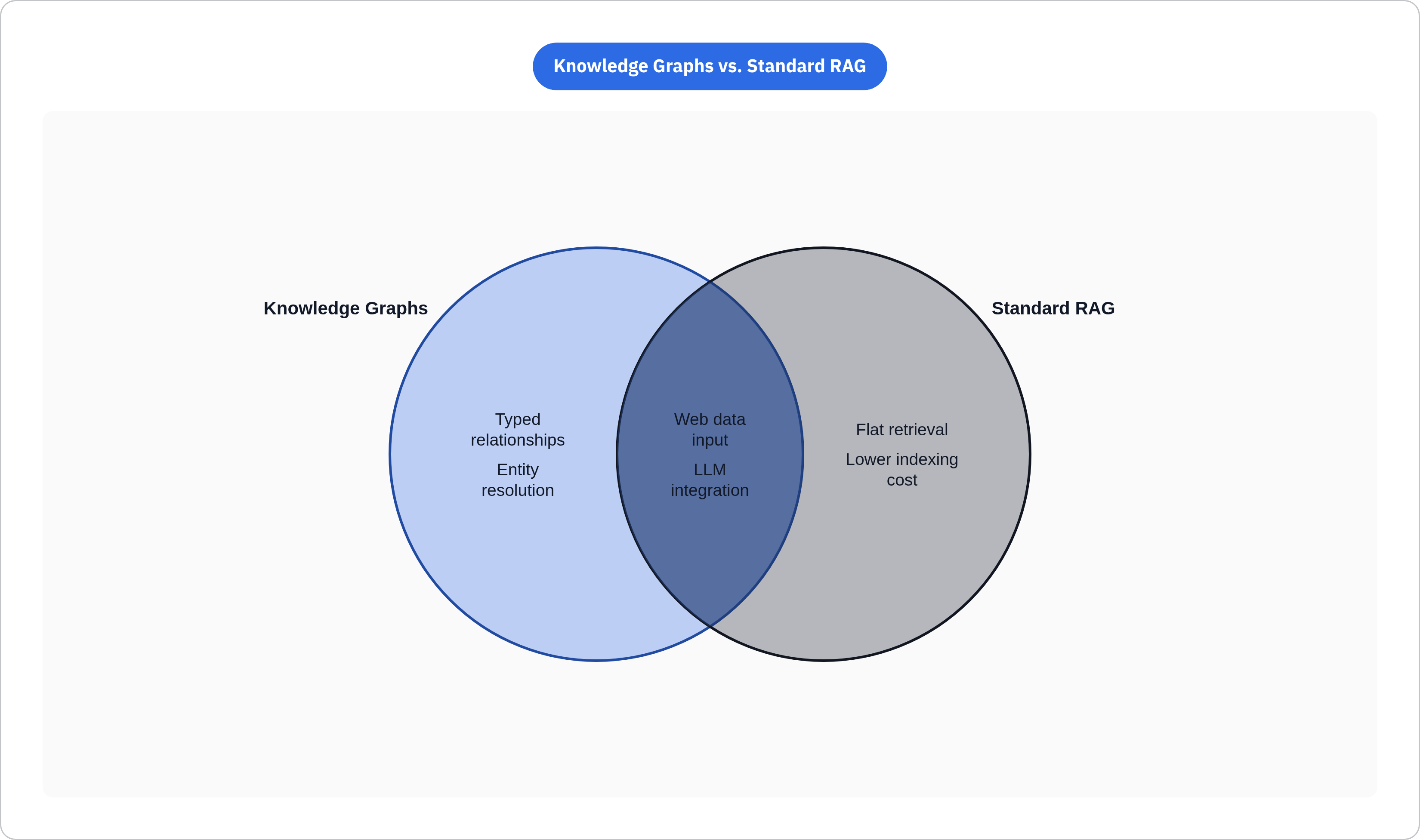
A knowledge graph is entities and the typed relationships between them, laid out as a network of facts. That's it, that's the whole idea. Standard RAG treats every document like a pile of loose change tossed in a jar. A knowledge graph works more like an actual map, where the roads matter as much as the towns.
When an agent builds one, it tracks a handful of specific things. Entities pulled from sources: people, companies, ideas, claims. Typed edges like "authored," "contradicts," "acquired," "succeeded." Provenance, meaning which URL and which passage produced each node. And time, since facts get asserted on a date and relationships shift underneath them later.
That structure lets you do things flat retrieval struggles with. You can chain A to B to C. You can tell apart two mentions of "Mercury" that mean completely different things depending on context. You can check a fact against the graph's own internal logic instead of trusting whatever sentence you happened to read last.
The visualization's job, then, is making that structure walkable. Someone traces a claim back to its source. Someone spots a contradiction sitting right there in the data instead of buried three paragraphs deep. A downstream agent queries the graph directly instead of re-parsing a wall of prose it's already seen once.
One thing worth nailing down before we go further: an agent that hands you a bulleted list of findings has given you a list. It stays a list no matter how neatly organized, no matter what graph-like ambitions sit behind it. Everything below assumes that distinction is already clear.
How research agents build knowledge graphs from live web data at runtime
Nobody writes ETL scripts by hand for this anymore, not really. Agentic construction means specialized agents handle ingestion, adjust the schema as new data types show up, resolve entities, and attach provenance as they write, without some fixed schema a person decided on six months back.
Before any of that graph-building starts, there's a less glamorous problem sitting in the way: getting clean data off the web at all. Raw HTML causes real problems here. Feed an LLM a page full of nav bars, ad scripts, and inconsistent markup, and extraction accuracy drops fast. It needs Markdown or JSON, full stop. Search APIs, crawlers, anti-bot handling, all of it has turned into a real chokepoint given how much bot traffic the web sees now. Some APIs handle search, scraping, crawling, and batch delivery in one place, which means a team isn't duct-taping four separate tools together at four separate stages just to get text an LLM can actually read.
Entity resolution is the part that stays hard no matter how much you scale up. The same company shows up under five names across five sources, and something has to decide they're the same node. A hackathon project at VTT, built on Memgraph, used MCP-wrapped agent tools fed context-rich JSON prompts to make those calls repeatable. Same disambiguation logic, run twice, shouldn't quietly disagree with itself three weeks apart.
Graphiti, open source out of Zep, was built for graphs that need to track change over time: entities, facts, relationships that shift, provenance stapled to each version. It ingests incrementally, so new web data slots in right away instead of waiting on a full batch recompute. If your use case cares what was true last month versus what's true today, this tool addresses that exact question.
On the lighter end, zero-shot tools like iText2KG pull a graph straight out of raw text with automatic deduplication built in. No NLP team required, which matters a lot if you're a five-person startup and don't have one lying around.
Here's the number that actually stings: full GraphRAG indexing runs somewhere between 100 and 1,000 times the cost of plain vector RAG. Microsoft's LazyGraphRAG cuts that down to roughly a tenth of a percent of full indexing cost, which is the gap between a research budget and a rounding error on someone's AWS bill. Whichever construction approach a team picks isn't just a cost line either. It decides what the visualization layer even has data to work with later.
The GraphRAG ecosystem a visualization layer has to serve in 2025–2026
A handful of frameworks define what "the graph" looks like under the hood, and each one hands the visualization layer a different shape of problem.
Microsoft's GraphRAG (Edge et al., 2024) uses community detection to build hierarchical summaries, so it handles narrow entity lookups and broad thematic questions with the same structure. Rendering that community hierarchy well is its own design puzzle. You don't get to bolt it on at the end.
LightRAG runs a dual-level entity-relation graph paired with vector retrieval, pulling evidence from low-level entities and high-level concepts at the same time. A visualization here has to show two semantic layers at once without turning into a plate of spaghetti.
HippoRAG2 borrows from memory research. It pairs an external knowledge graph with Personalized PageRank to filter noise and surface multi-hop paths. Those PPR scores map naturally onto visual weight: bigger nodes, thicker edges, wherever the score says look here.
LinearRAG targets large deployments with linear-complexity ranking. At that scale, dumping the whole graph on screen at once is pointless; nobody can read three thousand nodes at a glance. Progressive disclosure carries weight that extra screen space can't provide.
Here's the wrinkle nobody puts in the pitch deck: some studies find GraphRAG actually underperforms plain RAG on plenty of real tasks, despite the theoretical case for it. GraphRAG-Bench, from June 2025, is the field's first real attempt to settle that with data instead of vibes. Its existence tells you the ecosystem is maturing, and it also tells you the argument isn't over.
Practically, figure out which framework built your graph before shopping for a visualization tool. Schema, community structure, and scale differ enough across these systems that picking the wrong tool means it fights your data instead of showing it.
What visualization tools exist and what each one is actually designed to do
Three buckets, sorted by the job they do: exploration for analysts poking around, development for engineers building on top, embedded for visualization baked straight into a product.
Exploration tools. Neo4j Bloom lets analysts search and filter a graph visually without writing Cypher, and it already shows up in finance and cybersecurity for exactly this kind of investigative digging. Hume, from GraphAware, covers the full workflow (ETL through text search into data science) and lands in national security and recommendation systems, where the graph work has to hold up end to end, not just look nice in a demo.
Development tools. Neo4j's NVL library powers the current Neo4j Browser and Bloom, scales to thousands of nodes, and ships with a React wrapper that gets integration down to a handful of lines. Good pick if a team wants a custom exploration UI sitting on a Neo4j-backed graph. D3.js gives fine-grained control over force-directed layouts and plays well with other frameworks, at the cost of a steeper learning curve. It earns its keep when the visualization needs heavy customization and there are front-end people around to do it. ipysigma, built on Sigma.js, brings interactive graphs into Jupyter notebooks, which fits research workflows where you're still poking at the graph before any product UI exists.
Embedded and agent-facing interfaces. AGENTiGraph (arXiv, August 2025) runs a dual-mode setup: a chatbot mode for natural language queries, and an exploration mode for manual navigation with entity recognition and hierarchy browsing. It's the closest thing published so far to a visualization layer built natively for research agents rather than retrofitted onto one after the fact. Neo4j's LLM Knowledge Graph Builder, since launching in June 2024, has become the fourth most popular source of user interaction on AuraDB Free. That single number says plenty about how much developer appetite exists for LLM-to-graph pipelines with the visual layer already attached.
Temporal visualization. Tools like GraphXR and Bloom show graph snapshots or animate change across time intervals. That matters directly if your pipeline runs on Graphiti or anything else tracking how facts shift across agent runs.
Designing the visualization for what research agents actually need to show
Agent-built graphs don't sit still. They grow incrementally, drag provenance metadata behind them like a tail, and sometimes encode flat-out contradiction between sources. A good visualization shows all three without turning into noise.
Provenance deserves better than a footnote in a tooltip nobody clicks. Every node and edge should trace back to a source URL and the agent step that produced it, whether through color coding, hover text, or a side panel with the receipts laid out plainly. Hide the provenance, and you've thrown away the entire reason to use a graph instead of a summary paragraph. Those chains are what let a person, or another agent, follow a multi-hop inference all the way back to the original page. That accountability piece separates a graph from LLM prose you just have to take on faith.
Scale is a separate headache from provenance, and it shows up fast. A graph built across multiple research sessions can't get dumped on screen at once and expected to make sense to anyone looking at it. Progressive disclosure works: show the high-level clusters first, the way Microsoft's GraphRAG does with its hierarchical summaries, then let people drill down as curiosity demands. Filtering by entity type, time window, or confidence score cuts noise without gutting the structure underneath. This gets real fast once you're working at something like LinearRAG's scale, where rendering strategy starts mattering more than whichever layout algorithm you picked off the shelf.
Two audiences want different things from the same graph. Humans explore for insight. Agents query for structured data they can act on. AGENTiGraph's dual-mode design is a decent reference here: a conversational layer for people, structured traversal for machines, both living in the same interface without stepping on each other's feet. Exporting the graph as JSON-LD or RDF means downstream agents consume it directly, never touching the visual layer at all.
When two sources disagree, encode both claims as separate edges instead of letting the graph quietly pick a winner behind the curtain. Each edge carries its own source, so the contradiction stays visible instead of getting smoothed into false consensus nobody asked for.
For pipelines that run on repeat (competitive monitoring, news tracking, that sort of thing) showing how the graph changed across runs tells you more than any single snapshot could. A time slider on GraphXR or Bloom handles this directly, no extra tooling required.
Connecting the web data pipeline to what appears in the visualization
None of this matters if the input feeding the graph is garbage from the start. Feed the pipeline raw, malformed HTML, and entity extraction starts guessing wrong. Spurious nodes show up. Real relationships get missed, and provenance trails lead nowhere useful.
Research on structured web extraction (the NEXT-EVAL work, 2025) found LLMs hit strong accuracy on this task, but only when the input arrives properly formatted first. That puts the extraction layer at the front of the bottleneck line, ahead of anything fancier downstream. A web data API delivering clean Markdown or JSON is the floor requirement, a baseline the rest of the pipeline depends on.
That has real consequences for how the infrastructure gets built. The scraping and crawling layer needs to handle JavaScript rendering, get past anti-bot defenses, and hand back structured output someone doesn't have to clean up by hand later. Batch and webhook delivery matter too, since a graph can't update in anything close to real time if the data layer only supports synchronous pulls, one request at a time. Acquisition shouldn't balloon into its own separate engineering project six months in.
Monitoring adds another loop into the system. Detect a change on a tracked page, trigger a new agent run, extend the graph to match. The visualization then captures how the live web shifted, and exactly when, sitting right alongside whatever the agent found.
Audit the acquisition and extraction layer before shopping for a visualization tool. Fix noisy input upstream, well before rendering enters the picture, since no renderer, however well built, fixes bad data after the fact.